
Excel: Series Rendering Order
[ ]Excel renders series in a chart in the order they’re listed in the Select Data Source dialog:
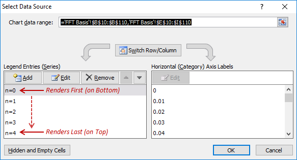
This can aid the readability of charts with multiple, overlapping series.
For example, I’m currently working with the following function:
\[\Phi_n(x) = \sqrt{2}\cos{\left[\left(n+{1\over 2}\right)\pi x \right]}\]I want to show the behavior of the function over the domain \(x=[0,1]\) as a function of the parameter \(n\), for illustrative purposes. Below are two plots of these functions, with the rendering in decreasing and increasing order of \(n\), respectively. The brightness of the line for each series increases with increasing \(n\), providing a natural visual progression:
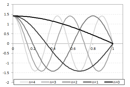
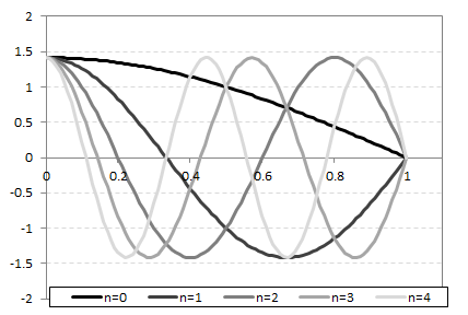
To my eye, the second figure is much less visually intuitive and much harder to read. I think it’s because the lighter colored lines chop up the darker ones (especially for \(n=0\) and \(n=1\)), semantically clashing with the ‘stronger’ nature of the darker traces. Having the darker lines “walk over” the lighter ones, as in the first figure, just seems to work better.
Proper selection of the series rendering order allows tweaking figures to exploit this sort of thing.
This post was written with StackEdit.