
Excel: Macro for Automatic Chart Re-formatting
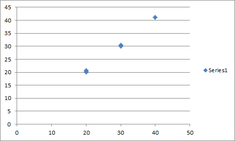
[ ]Excel’s default chart formatting is … not amazing.
While aesthetic preferences differ, to my eye I’d far rather it have:
- No legend (I usually prefer labeling series directly)
- No border around the chart object (cleaner when pasting into reports, etc.)
- A border around the full plot area with color matched to the axes & ticks
- A lighter shade of gray and dashed lines on the gridlines
- A larger font for the axes tick labels
- Axis labels for both the x- and y-axes
While I’ll often want to tweak further, these would
provide a solid formatting baseline. While it would be
possible to define a custom chart type with these properties, I’d have to
define a custom type for every charting variation (scatter, line, column, etc.).
I’d much rather just generate the default chart I want from the Insert tab
and then be able to reformat it from there.
So, I finally took the time to write a macro for the reformatting, convert it to an add-in, and bind it to a keyboard shortcut. (I have eventual plans for eventually writing up the procedures for add-in creation and keyboard shortcut binding…eventually. Maybe.)
Sub FormatInlineChart()

    Dim ca As ChartArea, co As ChartObject, pa As PlotArea, cht As Chart
    Dim shp As Shape, ax As Axis

    Set cht = ActiveChart
    If cht Is Nothing Then
        MsgBox "No chart selected!"
        Exit Sub
    End If

    Set ca = cht.ChartArea
    Set pa = cht.PlotArea
    Set co = cht.Parent
    Set shp = co.ShapeRange(1)

    With ca
        .Format.Line.Visible = msoFalse
    End With

    With co
        .Width = 300
        .Height = 250
    End With

    With cht
        On Error Resume Next
            .Legend.Delete
        Err.Clear: On Error GoTo 0

        Set ax = .Axes(xlCategory)
        With ax
            .HasTitle = True
            .AxisTitle.Text = "[X-Axis Text]"
            .AxisTitle.Characters.Font.Size = 14
            .TickLabels.Font.Size = 12
        End With

        Set ax = .Axes(xlValue)
        With ax
            .HasTitle = True
            .AxisTitle.Orientation = xlUpward
            .AxisTitle.Text = "[Y-Axis Text]"
            .AxisTitle.Characters.Font.Size = 14
            .TickLabels.Font.Size = 12
            With .MajorGridlines.Format.Line
                .Weight = 0.75
                .ForeColor.RGB = RGB(210, 210, 210)
                .DashStyle = msoLineDash
            End With
        End With
    End With

    With pa
        With .Format.Line
            .Visible = msoTrue
            .ForeColor.RGB = RGB(127, 127, 127)
        End With
    End With

End Sub
After running the macro, the chart looks like this:
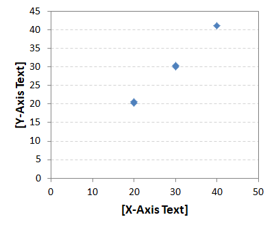
Now that I look at it, it might be a little tall – a co.Height of 220 or
so might be preferable. But, that’s easy enough to change. I could also always
augment the macro so that it queries for the desired dimensions, font sizes, etc.
before doing the reformatting.
The initial trawl through the object hierarchy is probably the least obvious part
of the whole thing; everything else is a pretty straightforward modification
of properties.
ActiveChart
yields the relevant
Chart object,
which then exposes the needed
PlotArea
and
ChartArea
properties. Resizing the overall chart requires access to the containing
ChartObject,
which is accessed through ActiveChart.Parent.